Screenshots
This week I revitalized and rethought out the middle section of the first stage. Honestly it was boring, unimaginative, and didn't make much sense.
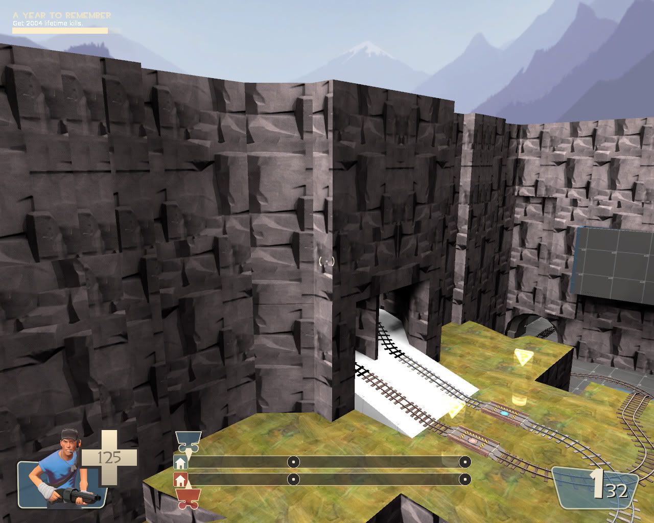
As you can see the main area here is pretty simple. It literally is a "boxed canyon"
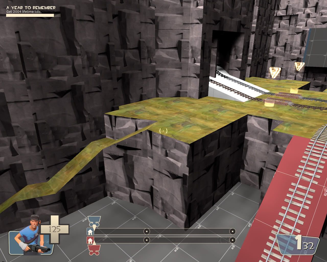
I liked the shaping and the design of the natural ramps that provide a secondary route to the top.
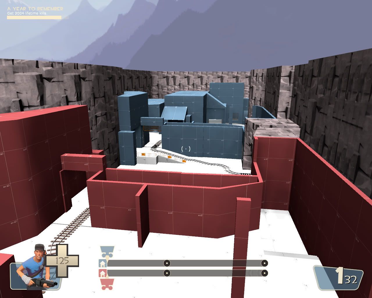
This area was the source of many problems. I just hadn't thought it out much and it is directly part of the middle control point area that I wasn't all that happy with either. In this iteration of the level I wanted it to be a naturally enclosed area (a tunnel), then I changed my mind for it be a open courtyard with both teams buildings and the canyon walls defining the space. Eventually I decided to go back to my original idea, which was to make it an interior. But I decided on making it a neutral building that shares the architecture of neither side.
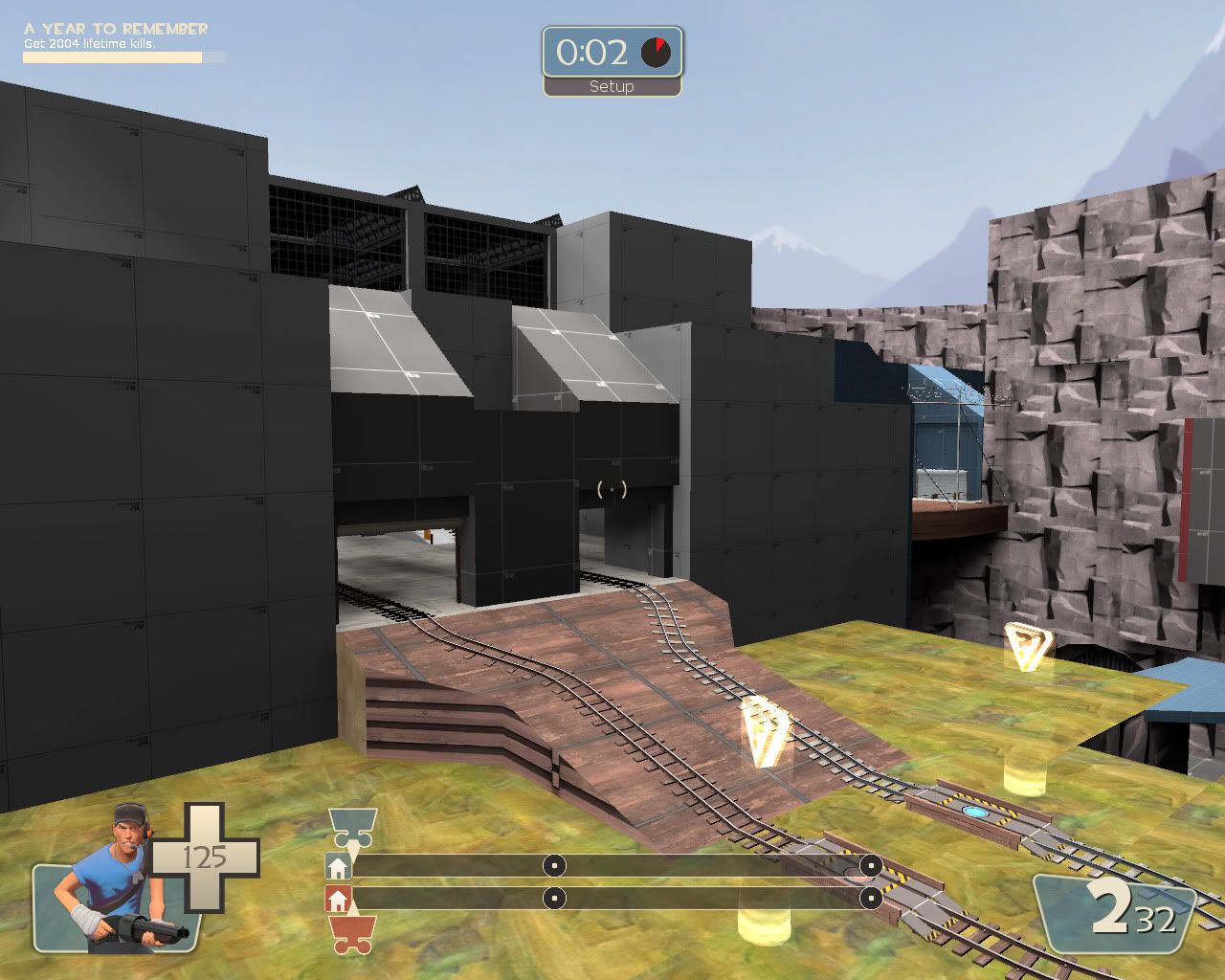
The new building has a dominating presence about it over the middle section.
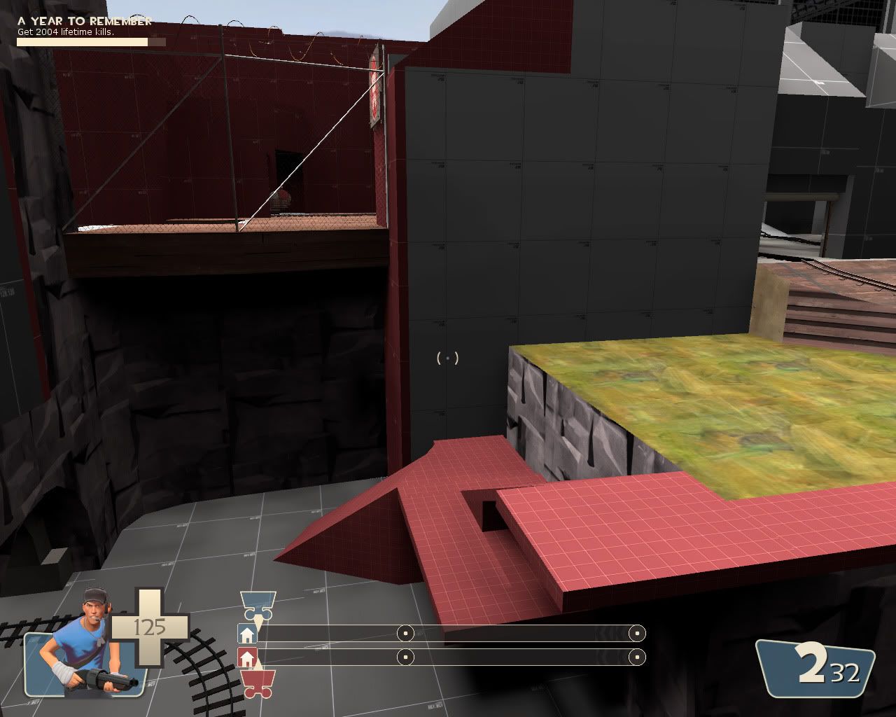
Part of the renovation was completely removing the rock wall that divided the area before. Now the building and a fence divides the the two spaces. A added benefit of using a fence is that a portion of the middle area and more importantly the control point is now visible from each teams upper spawn exit. Also the pathway to the top is now man made as the natural walkway no longer looked.... for lack of a better word, natural.
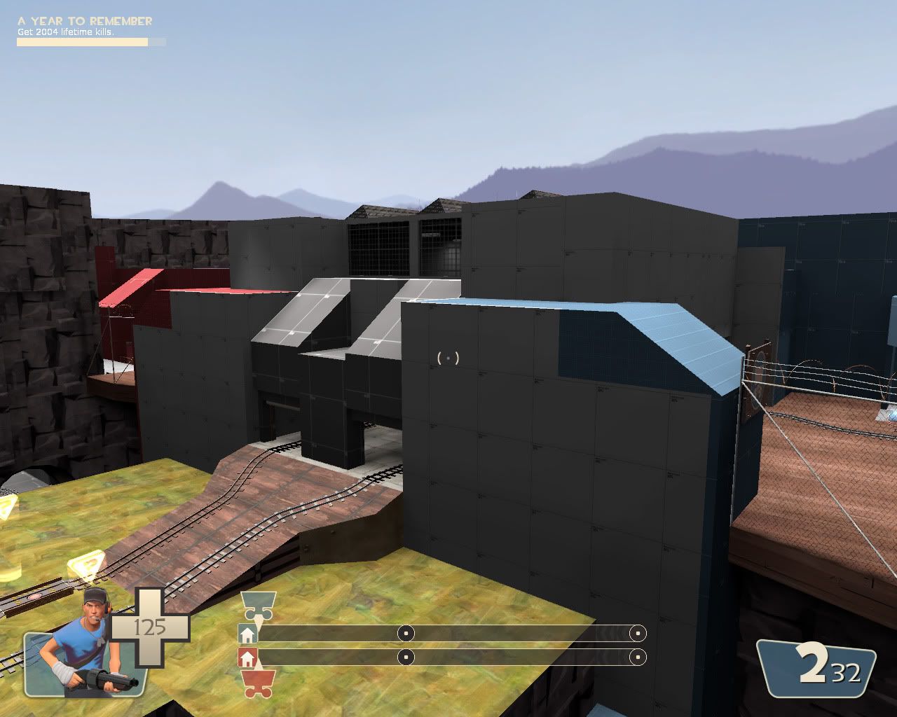
Overall you can see how much this area is now changed. The area in the far right of the screenshot was also enlarged and opened up more due to the size of the building vs the original plan.
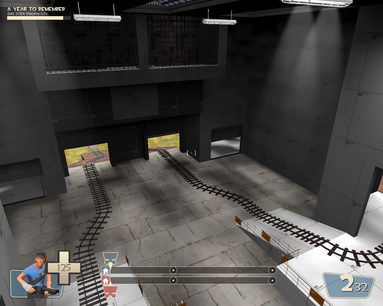
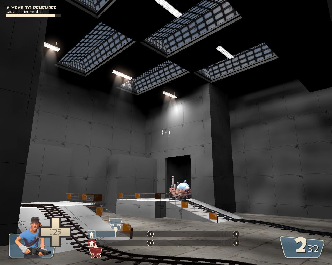
The interior of the building with temporary lighting. I wanted the building to feel open and large enough to hold a fight. I added several windows in an attempt to light the building with just the skylight however more interior lights will be needed to properly light the building.
That is the screenshot update for this week. Tune in next week where I might actually show screenshots of the second stage.
No comments:
Post a Comment